UI Wireframing
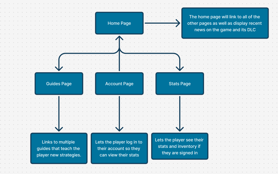
For UI wireframing I used Figjam to plan out all of the pages I planned to have in the app. I decided to add a home page, guides page, account page and a stats page. The stats page would have an inventory page and a stats page that shows the players level. The accounts page would be a page where the user can log into their game account, unlocking the stats page features. The guides page would include strategy guides for the player to help them beat the game. Lastly the home page would display news on the game, like patch notes and info on newly released DLC. This meets my goals mentioned in the design and research section of the process.
Layout Design
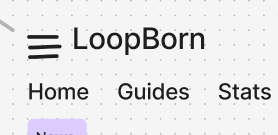
For the layout design I used the colours I chose in the design and research section and got to work. I created a basic layout that I thought looked clean and nice and then created a version with text boxes in to show how I would use the secondary colours. The side menu would have the same options, as well as more than the top menu with the Home – Guides – Stats options, but be easier to access for mobile users as their thumb wouldn’t have to travel as far if they pull up the menu on the side.
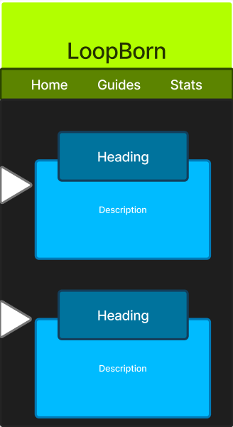

When deciding on the basic layout for the pages I was originally going to use a menu button at the top of the screen, but then I decided it would be better to make the menu button in the middle and bottom of the left side of the screen, as this would make the flow easier for the user with the buttons being easier to reach.