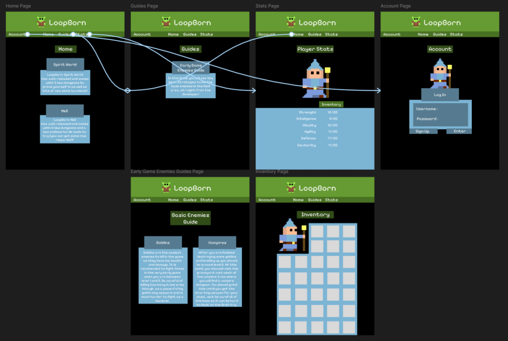
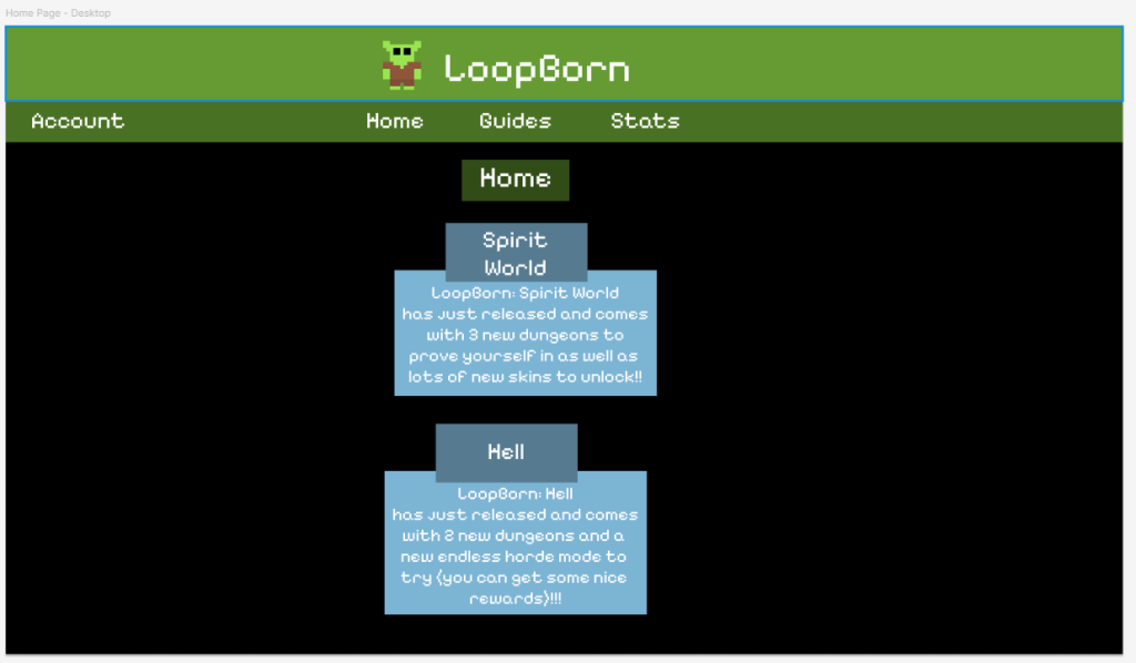
PC Design
I started this process by choosing the resolution I was going to use and it was a simple choice as most monitors run at 1920 by 1080 so I went with this resolution. After deciding on this I got to work I made the font of the text bigger as the screen size is bigger and can accommodate the bigger text. I also removed the sidebar buttons as I didn’t see a use in it anymore as all of the buttons could easily fit in the top bar now. Other than that i tried to keep the layout and content the same so the people on mobile and PC get the same experience and neither fell left.
This was quite an easy process and I already learned how to make the buttons navigate between pages so it didn’t take very long to do. And i soon moved on to creating the tablet design.
https://www.figma.com/design/9ghtI4JxV8liZJ1Vemdqxx/Companion-App-Desktop?node-id=1-222&t=JClLe0j0Zdgtsa4N-1Tablet Design
The first thing I did once again was decide on a resolution to go for. I decided to go with the standard tablet resolution, which is 768 by 1024 pixels. I then created a layout for the home page to base the rest of the pages on. I didn’t change the size of things much as this tablet resolution is quite similar to the mobile one, but I did get rid of the sidebar again as all of the buttons fit into the top bar.
After creating the home page doing the rest using it as a guide was quite easy and i only slightly changed the mobile layout where the wider screen helps fit more on screen at once like in the guide.